I haven’t found a GUI settings section in SCALER 3. I would like to make some changes that help me see the text on the gui’s dark background. If I missed it,please let me know where to find GUI settings. If there is not a GUI setting available, please advise how to make a feature request.
I am sorry too
I commented because I think to remember that devs stated that certain features that are currently lacking/flawed will be added/fixed in next versions of the same release; so e.g. SC3.1 or SC3.2 etc.
So true. But this seems to be a common problem in nowadays software: It seems “modern” to have terrible, much too dark GUI: Scaler 3, Sampletank, Chordjam, Audio Cypher, Magix Music Maker - all the same. Is it too complicated to program a much brighter GUI as an option? So the users can choose which one they prefer. And indeed: What can be more important than to offer a GUI the user is happy with?
It’s really hard to accomodate everyone. Same issue with Scaler 1, same issue with Scaler 2, same issue with practically every music software company I know.
One persons trash is another persons treasure. Yes, there have been a few of our valued users that struggled with the GUI, but a large majority loved it and still do. Having an interface that is customisable or a different skin will come and at least an alternative skin but even then it will not please everyone.
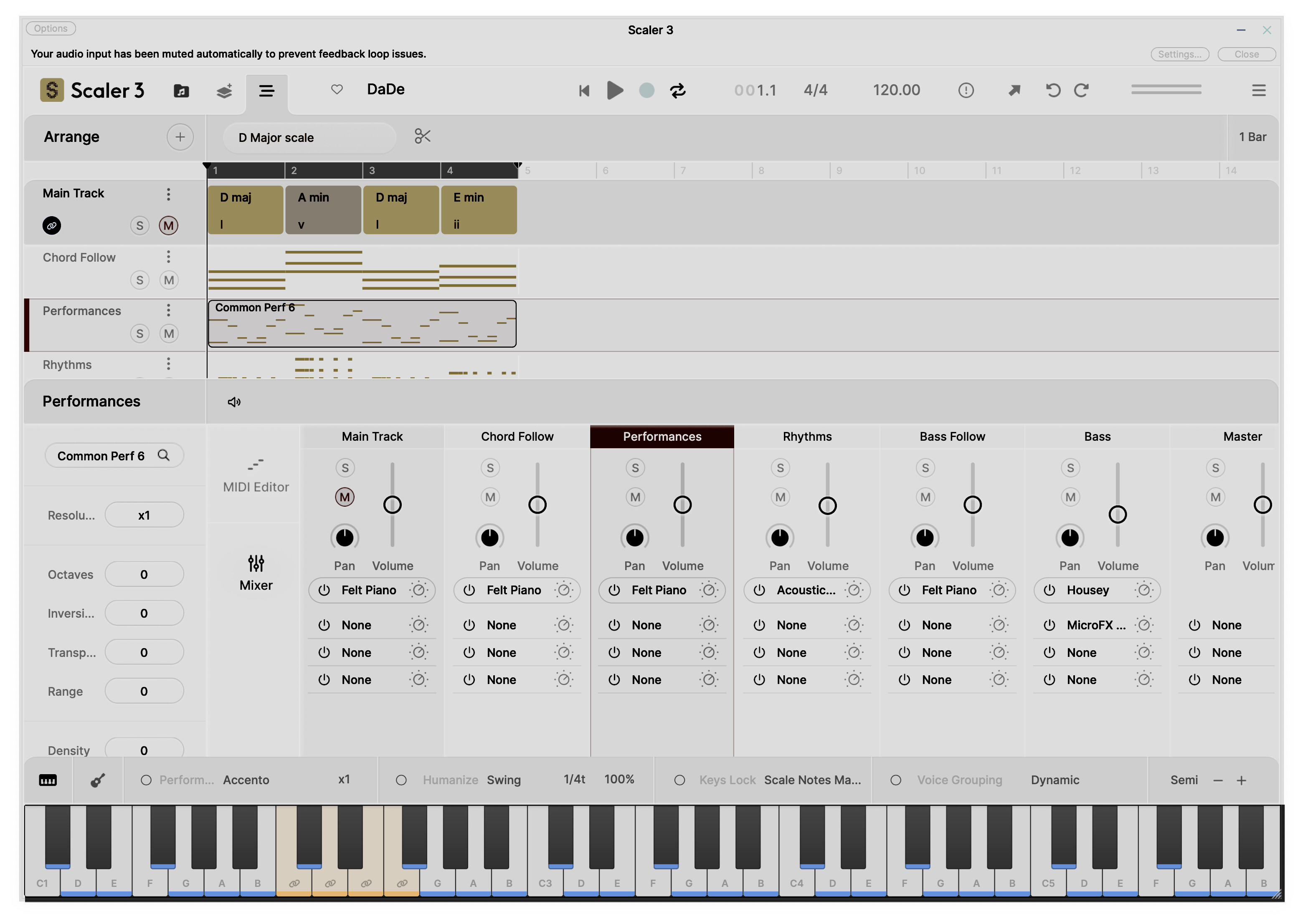
I created another thread about the GUI but will mention here as well. With all the huge 4k screens around today, it’s disappointing that Scaler 3 does not allow you to resize both vertically and horizontally - just proportionately. Lots of wasted space that would allow you to see so much more of the interface:
Not being mean here, guys, but did you ever think about the actual job of creating a pleasing GUI?
Then let me show you this. It’s the editor for an abandoned plugin called Nora (too sad it’s gone, btw!).
It looks quite simple … not much to change here. Really? Let me guide you through the process. Not the whole one, of course, because we all don’t have that much time.
Hi David.
I think the more simple way as offering different UI themes could be
a -set UI, and binded key COLOR or/and brightness slider.
I would like to love it.
All good suggestions! Been learning and must admit that it is very disappointing, on my 48" 4k monitor in Lanscape mode, to constantly be scrolling through the GUI - because (as I mentioned above) Scaler 3 does not allow you to resize vertically and/or horizontally - like, for example, Toontrack products.
I think both options would be helpful for all those (ony a few?), which are disappointed by the nearly unusuable or stressing dark GUI. It seems the newest version (3.0.7) still has the same problem.
The save button is not visible until you hover over the presets section (why is it called a preset when you’re saving a current session?) and then when it does show it’s so small you can’t see what it is.
Thanks, yes we have been discussing this with our UX team. We are getting to a planning stage and always appreciate mockups and suggestions. We had a light skin in Scaler 1 which I always liked. I will report back here when we have some progress on plans.
A question: Wouldn’t increasing contrast help more than a lighter version? It would be good to understand what the problem is precisely. Low contrast? Is it too dark overall?
I’d like a lighter GUI AND higher contrast, plus the use of a few more colours. At present it looks like you bought a job lot of blue and grey paint and nothing else!
Some GUI elements need to be larger too. The indication of the notes in the scale on the piano keyboard is currently only a few pixels high and the note names on the same are almost too small to read. The very light blue highlighting of white keys also needs to be bolder. In a brightly-lit room some of these things are hard to make out.
.
For me a light skin with an optimized contrast and maybe some more colors makes workin just a pleasure. I mainly work under daylight or outside in the garden. For this scenario a light skin is much better. As well our world is dark enough, so I do not need dark skins. Some good examples for a light skin are ReasonStudios, Ableton light skins, All Microsoft or Apple office products, nearly all HMI user interfaces have a light background.
Is it possible to make the GUI larger without having the text/elements scaling up? I want to use my screen real estate to see more of each component, rather than simply having each component rendered bigger.