For me a light skin with an optimized contrast and maybe some more colors makes workin just a pleasure. I mainly work under daylight or outside in the garden. For this scenario a light skin is much better. As well our world is dark enough, so I do not need dark skins. Some good examples for a light skin are ReasonStudios, Ableton light skins, All Microsoft or Apple office products, nearly all HMI user interfaces have a light background.
Is it possible to make the GUI larger without having the text/elements scaling up? I want to use my screen real estate to see more of each component, rather than simply having each component rendered bigger.
So, I get another informative email and a video telling me about the major things in 3.1. Including, apparently, many asked for by users. Yet, here we are, still with, for me, an unusable interface. Way too dark, poor contrast (I know I’m not the only one).
Paid twice for this now; v2 in November and v3 when it was released, expecting major improvements.
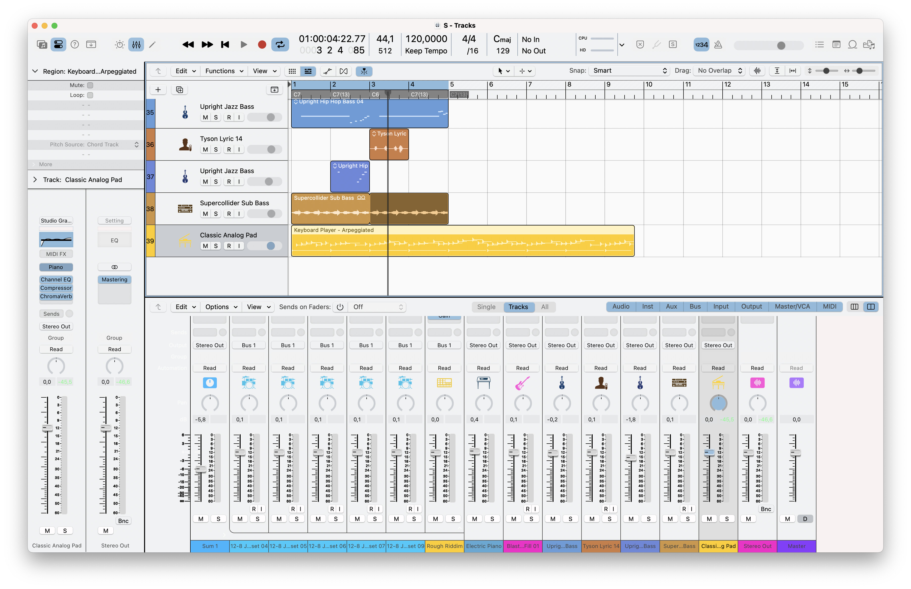
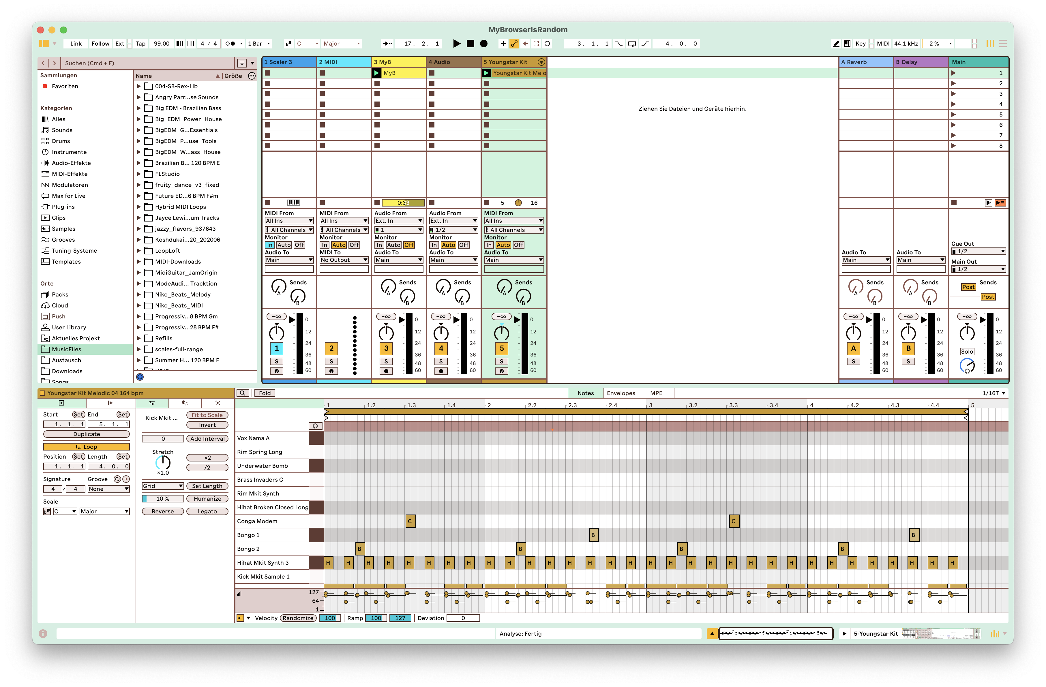
Having paid, hard earned cash, I am at the point of still being unable to use it. To add insult to injury, the latest (feature) video with Tristan, shows scaler sitting in front of Ableton Live (a DAW with a decent interface) - the comparison is marked.
It is not sufficient for developers to keep telling, paying customers, to be patient and seemingly, be resolute in not listening to major concerns.
Scaler remains unused, because the interface prevents me from doing so.
Finding the same problem. My vision is not that great and I struggle to use the program because the user interface causes a lot of eye strain after 20 - 30 mins of use so I give up with it. Scaler 3 desperately needs a light theme, or the ability to alter the interface yourself like you can in Studio One.
I’d really appreciate a light GUI too!
The dark theme is too low contrast, and depressing, with my eyesight as well.
The “inverse” mockup seemed fine, asa great starting point.
I think there is zero chance of that happening. Plenty of things for other users. I have paid twice and, still, cannot use it at all. Promises, promises.
Lovely to see new features for those that use Ableton. Happy for you all. Still, for me, zero improvements on the dark, unusable, interface. So, still, paid twice and it remains software I cannot use.